As I sit in my (almost) completed kitchen, I look back at all the design choices I’ve made in regards to colours, materials, finishes, etc. While I envision my perfect future kitchen to have white cabinets, for our current home, I knew I wanted a medium wood tone instead. And I, like many others, browsed furiously through Pinterest and pinned all the relevant kitchen ideas to my inspiration board. I’ve decided to share some of my Pinterest pins below, as well as the reasons why they influenced my design choices.
– This post contains affiliate links. Please see here for more information on affiliates. –
These above photos had the nice rich cabinet colour I was going for, and I really liked the beige backsplashes and stainless steel appliances. When we moved into our home, we had to purchase a new stove and fridge, so we were able to save money on the renovation by not purchasing new appliances again. I also preferred the light countertop, and knew that we would be going with natural stone, either granite or quartz.
Floors:
I should note that I was going to be using the same beige tiles that we had leftover from our bathroom renovation, but we would be doing a checkered pattern in the kitchen (mostly because we didn’t have enough for the entire kitchen floor, but also because I wanted something different for the floors). Actually, I would carry a piece of tile with me in my purse for months, and whenever I went into a home renovation store, I would check the sales they were having to try and find something that matched. I ended up buying the remaining tiles at a Rona Liquidation Sale/Store when I was visiting my family back home – they were such a great deal, were a bit lighter coloured, and had the same (medium) beige in some patches. My money saving tip: if you can delay a renovation project for a while, it might be best to buy the different elements whenever they come on sale (keeping in mind your overall design vision of course). I would never have bought tiles if I wasn’t sure they were going to go with the ones I already had.
Walls:
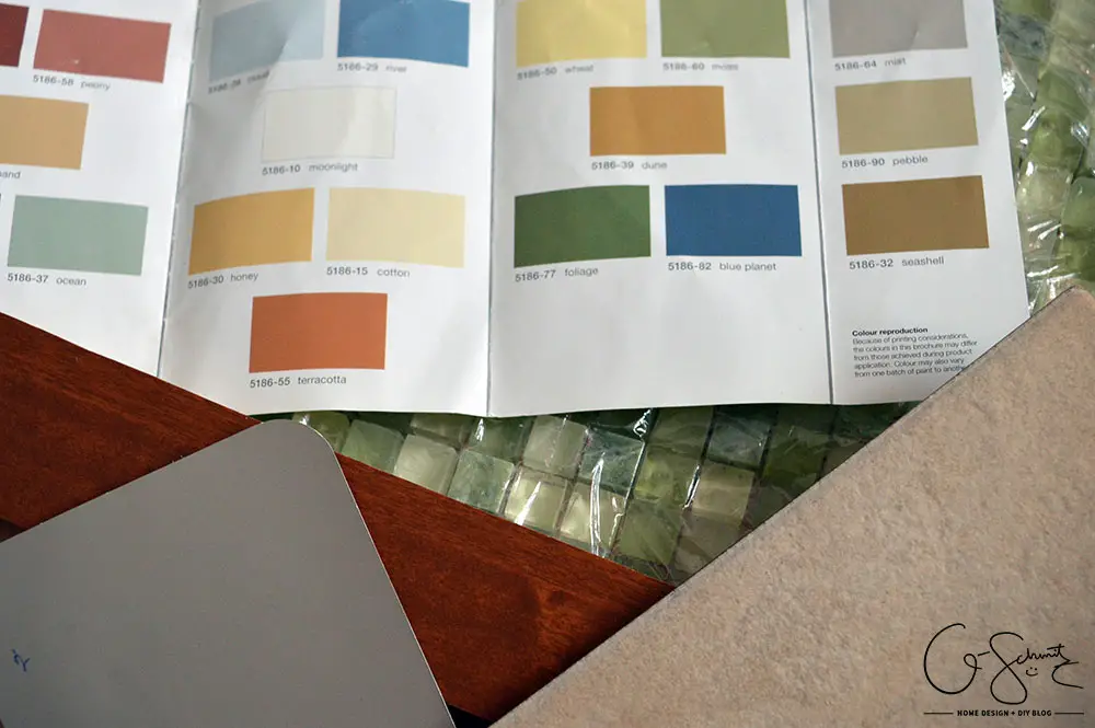
Anyways, my next design decision was the paint colour; I wanted something earthy, along the green or muted blue/green scale. I hesitate to say aqua or teal, because I think those descriptions invoke too much of a “bright” colour description, and I wanted the walls to more closely resemble (and coordinate with ) our taupe living room. In my opinion, Rona paint is the best quality paint out there (and note, I’m not getting paid to write this). I think I’ve been using Rona paint solely for the last 5 years, because, after using lots of different paint brands before this, I’m not sure if I would go back to another one. For anyone not from Canada, Rona is a home building and renovation store, similar to Lowes or Home Depot.
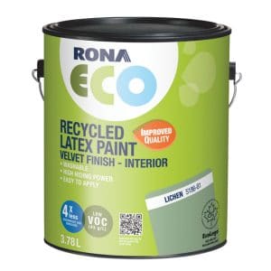
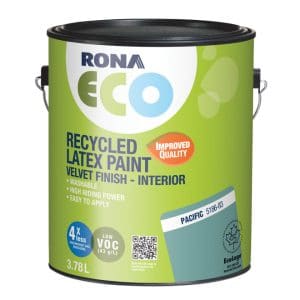
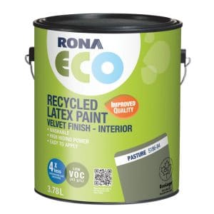
For the kitchen, I also wanted to try out the Rona ECO paint, basically an eco-friendly line of paint made from recycled paint… and it’s close to half the price of a normal Rona gallon of paint! Currently, there are only about 20 colours to choose from, so it helps narrow down the choices if you love paint and colours, like me! Here are the 4 colours I was thinking of going with (images from Rona, and links going to the respective product pages):

Backsplash:
For the backsplash, I knew I was probably going to go with glass tiles, and maybe something beige, to match the floors, and possibly bring in some blue/green elements to match the walls. Here are a couple of pins that best illustrate what I mean:
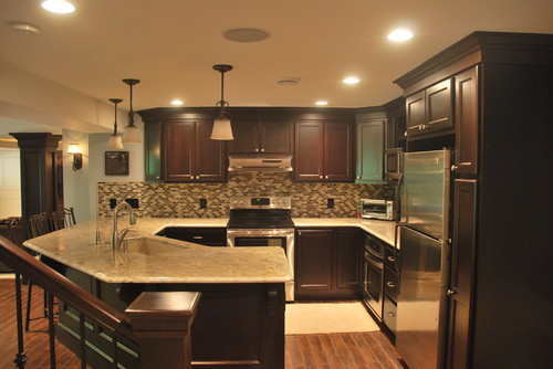
But those tiles would maybe be a bit too “non-traditional” and there was no way to tell if they were going to match the paint I wanted. What I really wanted were glass tiles with the “plain” brick pattern, highlighted below (and I liked the countertop and cabinet colours too)
So what final design choices did I end up making? Stay tuned to find out!


No Comments