

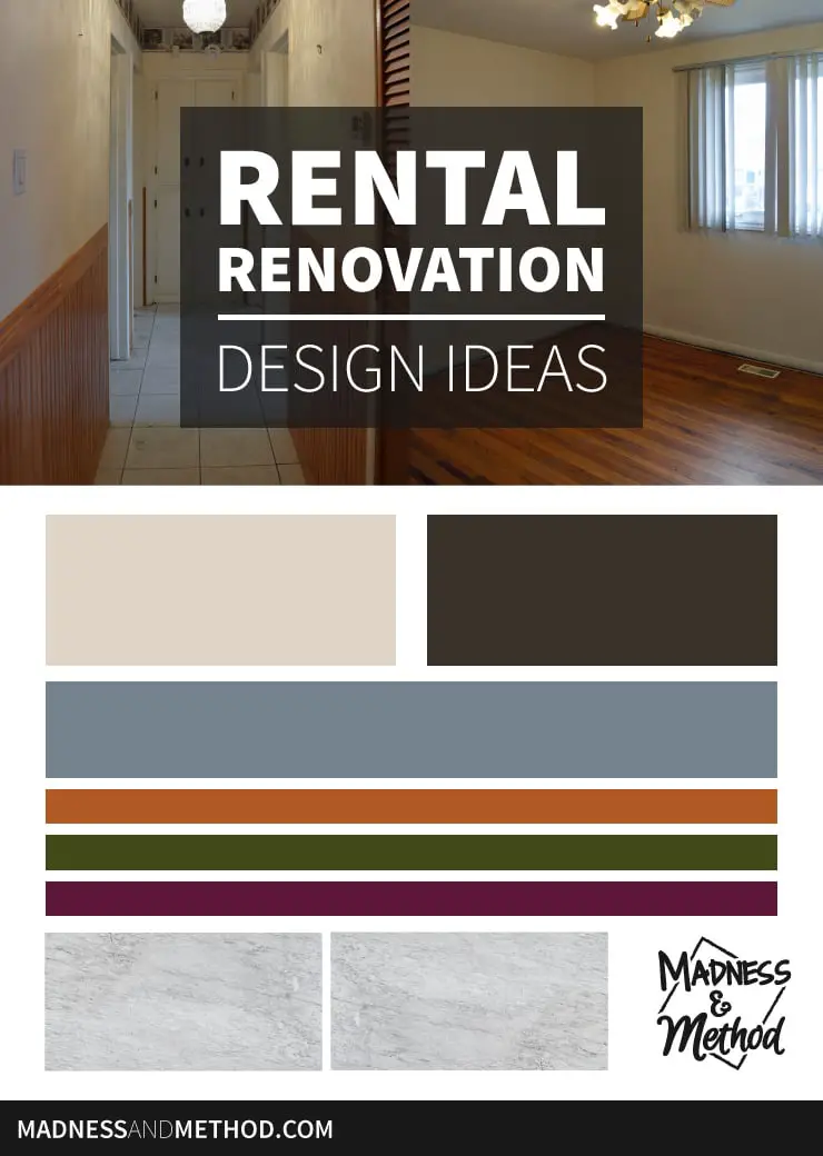
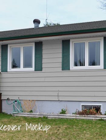
It’s almost halfway through the summer, our littlest baby is now 3 months old and we’ve barely begun working on our rental renovation. Well, that’s not accurate. We have been working on the rental renovation like crazy, but we haven’t even touched the basement (should be starting soon!) and I feel like I have a million unfinished projects upstairs that need to be completed before I can share anything. We’ve changed a couple of ideas since I shared the upstairs tour, and today I’ll give you a bit of an update and let you know the rental renovation design ideas (for the whole house) too!
– This post contains affiliate links. Click here for more information on affiliates. –
Okay, first things first. Rather than just “clean up” the upstairs and get it renter-ready (we think we’ll be staying in the basement), the Husband said it would be better to give everything a proper refresh, including painting ALL the walls and refinishing the living room floors.
Which is the last thing we’ll do because that seems like it will be a beast of a project!
In the meantime, I’ve been painting like crazy… and haven’t really even gotten halfway done :( BUT planning to paint everything did allow me to come up with a design direction for the upstairs (which we’ll most likely be copying downstairs) so that was fun!
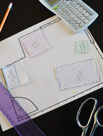
Rental Renovation Design
Here is what I came up with:
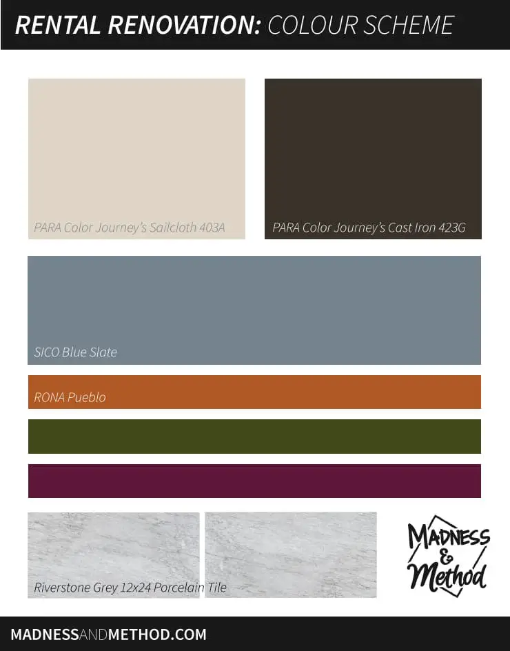
(I originally had a slightly different colour scheme posted, but just added the purple/red!)
Let me explain how this all came about because it’s probably a super-backwards-don’t-copy-what-I-did story.
Before we decided to paint everything upstairs, the original plan was to just clean the walls and call it quits. The Husband said that one of the bedrooms had a lot of scuff marks and we should probably paint it to make it look nicer.
Okay great, so we went to the local hardware store and picked up a gallon of one of their mis-tinted paints (SICO Blue Slate, a medium-toned cool gray colour).
One of the projects we needed to do was tile the entranceway. There was a carpet that had been ripped up before we saw the house, and it was a mis-mash of plywood and random wood flooring that was now exposed. I headed to the Home Depot and picked up some nice gray 12×24 tiles and thought they would work perfectly for the space. In the future-future, I’ll want to redo the upstairs kitchen and knew that I wanted to use the same floors for the entry as the kitchen, and a medium gray is what I needed for that. (Is it weird that I designed the kitchen we’ll be doing in a few years?).
Anyways the tiling became the priority, and after I did that, then the Husband decided to make the rest of the house look good to match.
Caught up to the timeline now?
So now we have one gallon of a medium gray, and an entire house to paint (in which we’ll need a LOT more paint). I didn’t want the bedrooms to be as dark as the gray we had, and I knew I wanted the living room to be something dark.
Oh, and I also decided to paint the inside of the front door a bright colour too and was originally thinking something in the blue-teal family. Then I was scrolling through Instagram and saw this post about the colour coral… and it was like aha! I hadn’t even thought of something in an orange colour, and what do you know – I had even brought our leftover bathroom paint to the rental house just in case we needed it. (Originally it was to mix with the Blue Slate paint and white to warm it up and/or make a new colour).
Still following me?
I went home and went through all the paint swatches and books I had, and came across this:
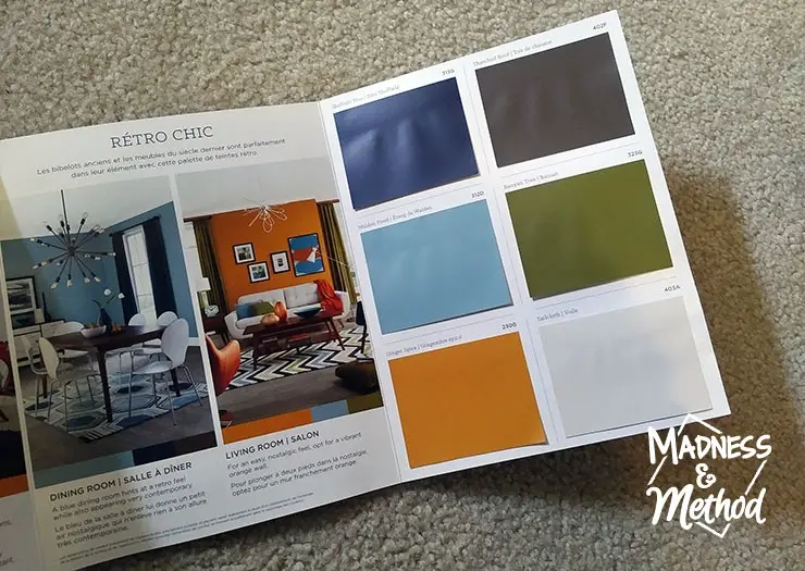
It’s a PARA Color Journey’s book showing a “Retro Chic” colour scheme and I was like yesssssssssssssssss. Not only does it have an orange close to what our bathroom colour is, but I thought that the blue was similar to the one we have throughout our basement. Which I thought would be great in the future for when we move our stuff in there.
ANYWAYS so then I decided to use the same light colour that was in this colour mix but was originally worried it was too light. Isn’t it hard to tell how bright or dark a colour on a small swatch is? I definitely didn’t want anything “white” but was thinking a nice, light warm gray would be great (almost a cross between a beige and a gray).
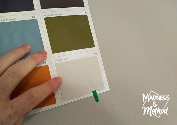
So I held the swatch up to our basement walls (which is the lightest colour we have in our house) and like that it’s a smidgen lighter, but still pretty similar and definitely not reading as white. It should make a nice bright bedroom colour!
For the darkest colour, I found a nice swatch in the PARA Neutral Ground book, and I’m hoping it works great for the living room (it’s a super warm colour, almost like a dark gray/brown).
Either way, I’m hoping everything comes together and flows nicely, even though I’ll be using the different cool and warm colours throughout the space (the Blue Slate will be in the entry and hallway).
I hope these rental renovation design ideas and colour schemes work out, and I know there is a lot of painting in my future! Like I mentioned before, I have a lot of projects that have been started… but nothing is officially done-done that I can show off yet. You may have noticed that the green (and newly added purple) don’t have a paint colour/name yet, and it’s because I think I’ll bring it in more with the accessories.
But we shall see :)
OH and make sure to follow my Pinterest board with all my rental design ideas:
I’m thinking the upstairs will be more of a classic/traditional look, but the basement will be more modern…
Stay tuned!


2 Comments
JHA Australia
December 15, 2021 at 12:40 amAwesome content and renovation ideas that every owner can follow through on their next renovation plans.
Nicole
December 15, 2021 at 12:53 pmThanks!