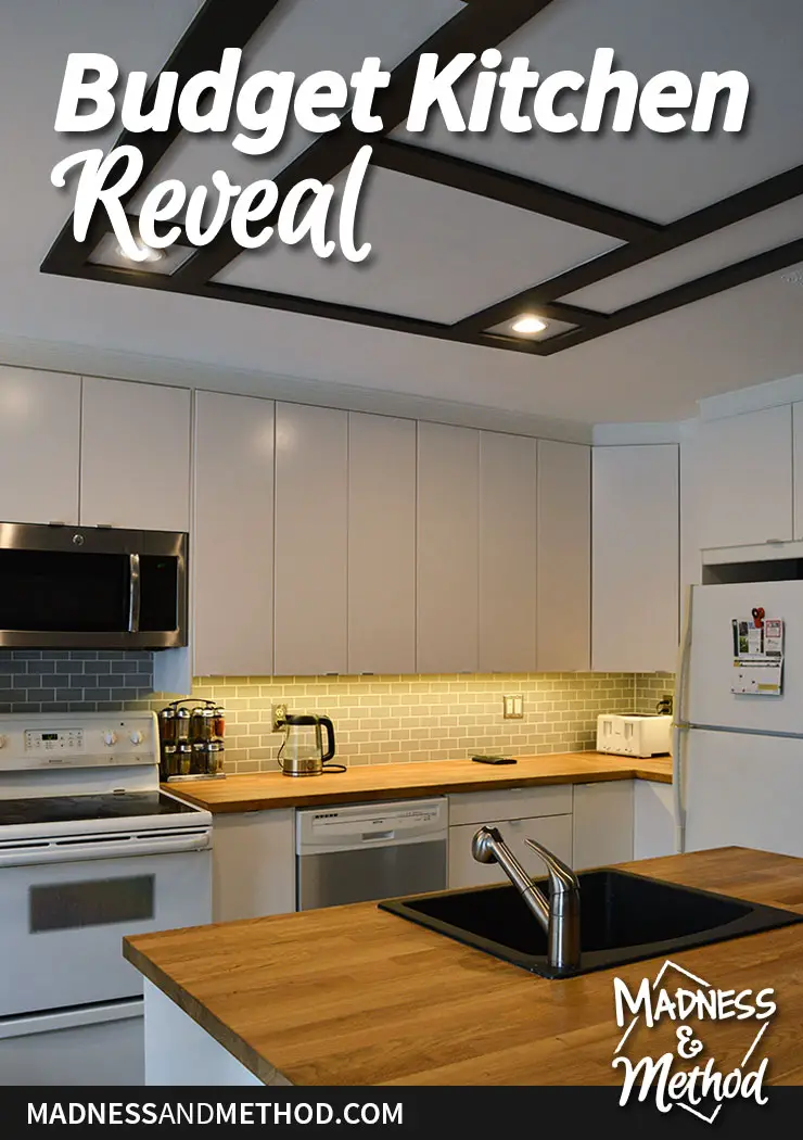
It’s the end of the month – which means I’m sharing my brother’s budget kitchen reveal! All month long I’ve been showcasing the work we’ve done in his kitchen, so if you’ve been waiting patiently to see the final pictures… the time is now!
Now, if you didn’t get a chance to see the before pictures and plans for the space, you can check that out. (Don’t worry, I’ll have some before and after pictures below too!). I told him that his kitchen renovation would take a week, but it took a few months instead (oops!). The demolition uncovered some non-planned extra work, and the fact that he lives super far from me added to the timeline…
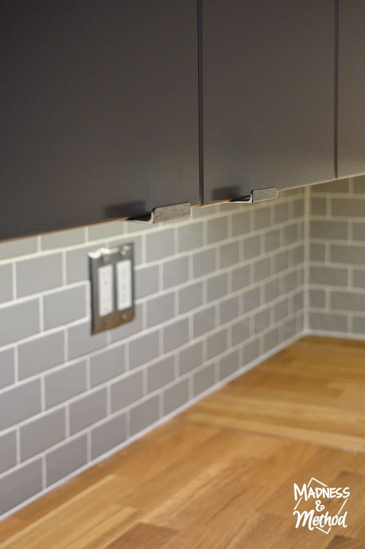
While we had most of the space in a workable state, we finally finished the last details when I was down remodeling his half-bathroom for the One Room Challenge. (Like the under-cabinet lighting, backsplash, faux coffered ceiling and trim above the cabinets.)
Ready to see what the kitchen looks like now!?
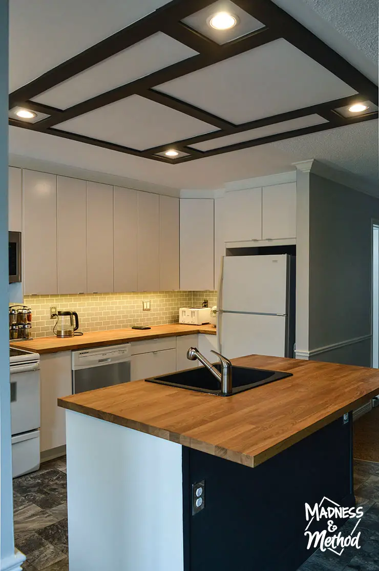
Here is the view from the front entrance! I gave a sneak peek at this new space last week when I talked about the faux coffered ceiling. Removing the closet and pantry cabinets created an open-concept space and allowed us to put in a nice island.
(My brother is planning on updating his appliances in the future, so we made sure to allow for extra room around the fridge to accommodate a larger size).
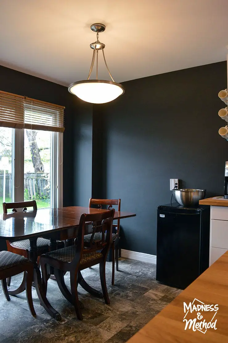
His dining room was cleaned up and painted black (you can see a roundup of awesome black dining rooms here).
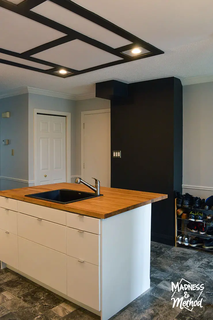
And we painted a few other new elements black as well. The “black box” on the back wall is where we moved all the HVAC and plumbing lines, and I kept telling my brother that it reminded me of the box in 2001: A Space Odyssey.
Although, he had never seen the movie and didn’t know what I meant. And no amount of hopping around and screaming like a monkey explained it any better.
Weird right?
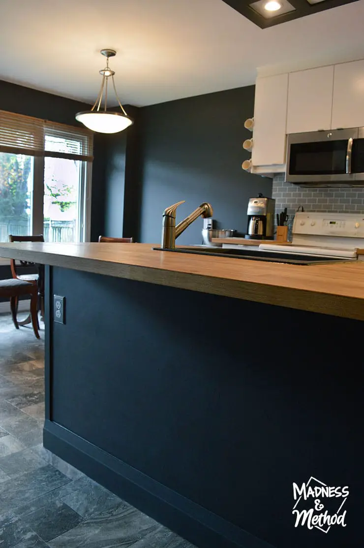
Mirroring the black look, we painted the back of the island the same colour. My hope is that he’ll eventually have 3 stools here, and the black helps hide feet dirt!
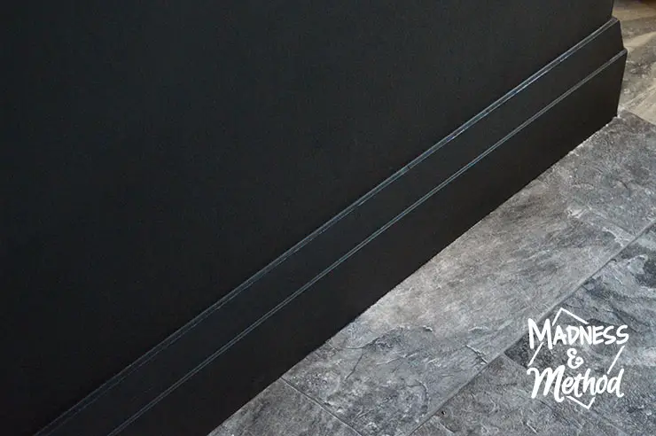
We even painted the baseboard trim black (it was a leftover Metrie baseboard piece from his bathroom). I think the black looks super sleek, and it went with our whole “black is new and cool theme”. Ha, my brother said he preferred if it was white, so my Dad and I painted it black and left him some white paint (just in case he wants to do it himself!).
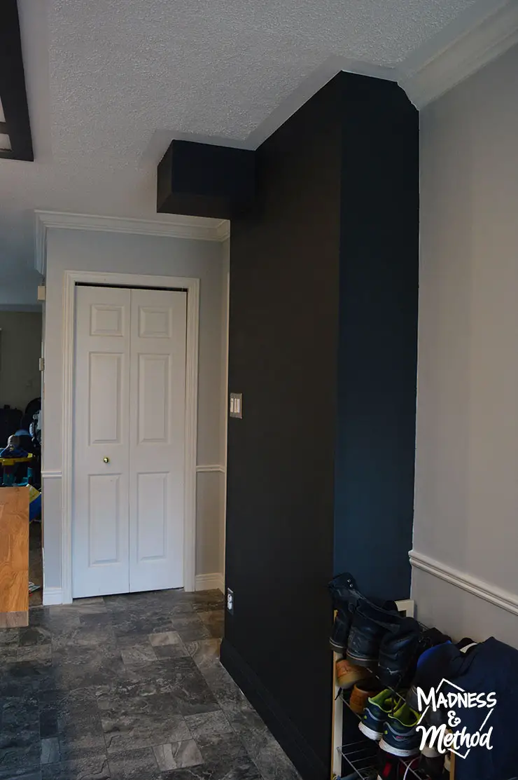
We moved all the light switches to this new wall, and it ended up being the same depth as their shoe rack. (PS: You can totally spot the Mister if you look down the hallway).
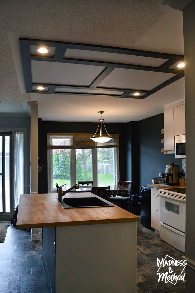
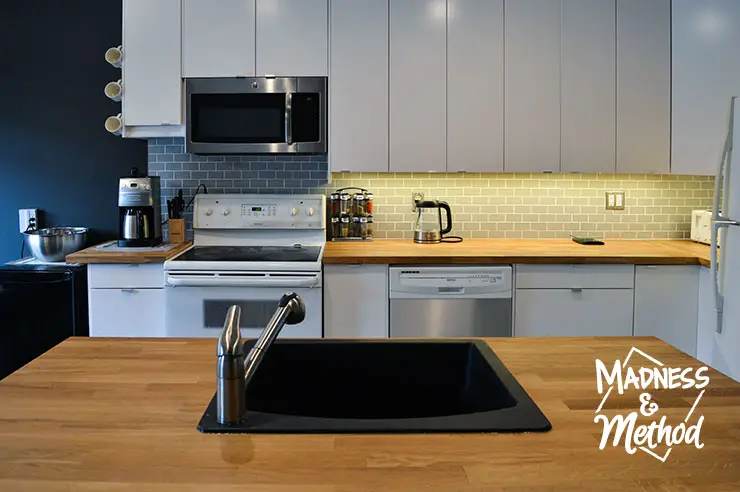
Standing in the hallway and looking back towards the front of the house, you can really see how open everything is with the wall gone. My brother also chose the biggest sink he could find, and I like that the black goes with our colour scheme!
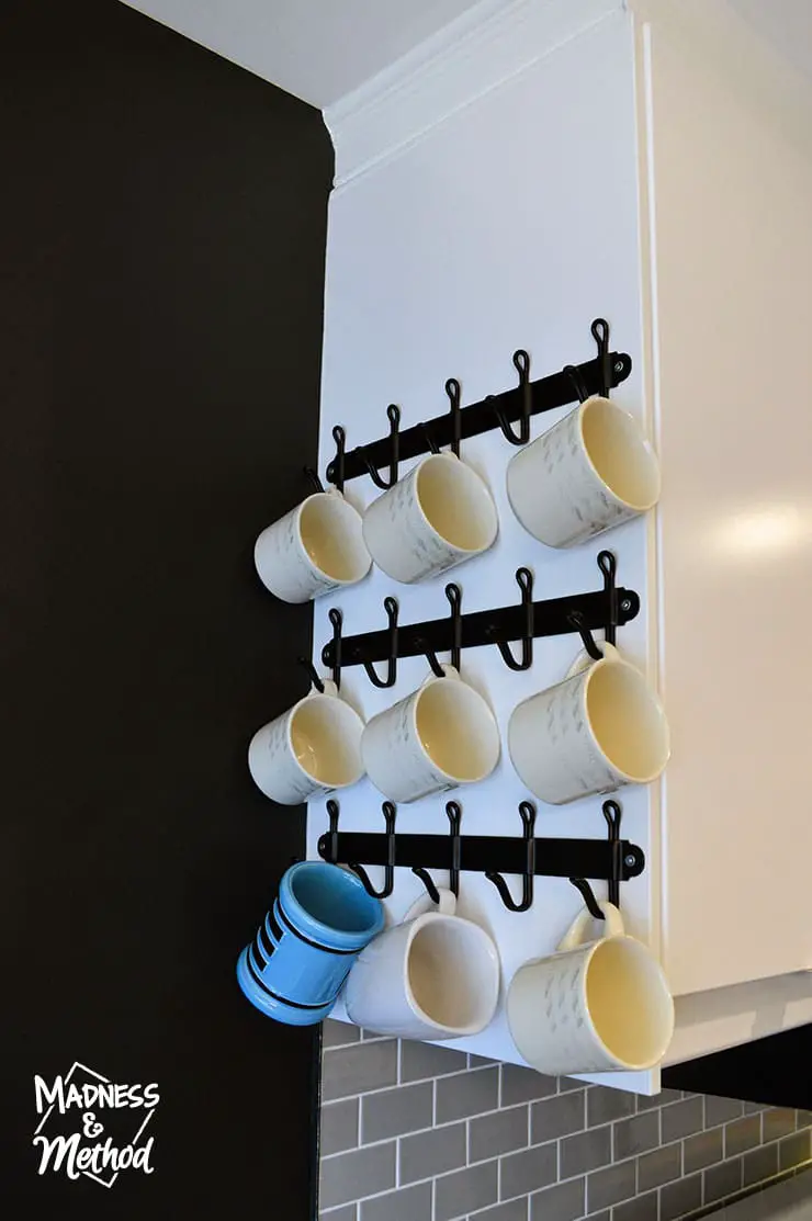
Another fun thing we added was making a “coffee station” to the left of his oven. The lower cabinet actually extends out a few inches more than the upper cabinet, but the mugs make up the difference. (And, those are totally towel hooks if you were wondering why they only fit three mugs!). It was really hard to find mug hooks that fit on the side of a cabinet, and I really liked the look of these!
Oh, and we’re going to install another one above it so it’s fully stocked :)
Budget Kitchen Details:
What makes this a budget kitchen? While I’d love to give you a full breakdown, I actually don’t know the exact costs since my brother paid for everything. (So it was really cheap for me, ha!). But seriously, I’ll go over some of the places where we saved money:
Labour: Almost all DIY, so my brother saved a BUNCH of money
Cabinets: We went with an Ikea kitchen, and my brother just happened to pick one of the cheapest doors
Appliances: He kept everything he had (the OTR microwave is new) and is planning to update them in the future
Countertops*: The cheapest (island size) Ikea butcher block, great for DIY installs!
Hardware: I wanted something sleek, that would blend in. We chose the default Ikea handles, although did have some issues…
*My brother wanted black quartz counters. I told him it would take too long to template (when we were aiming for a week reno) and would be really expensive (thousands of dollars vs. hundreds). He’ll probably upgrade these in the future too, but in the meantime they add some warmth to the space.
Oh, you totally noticed I added stainless steel on his dishwasher too right?!
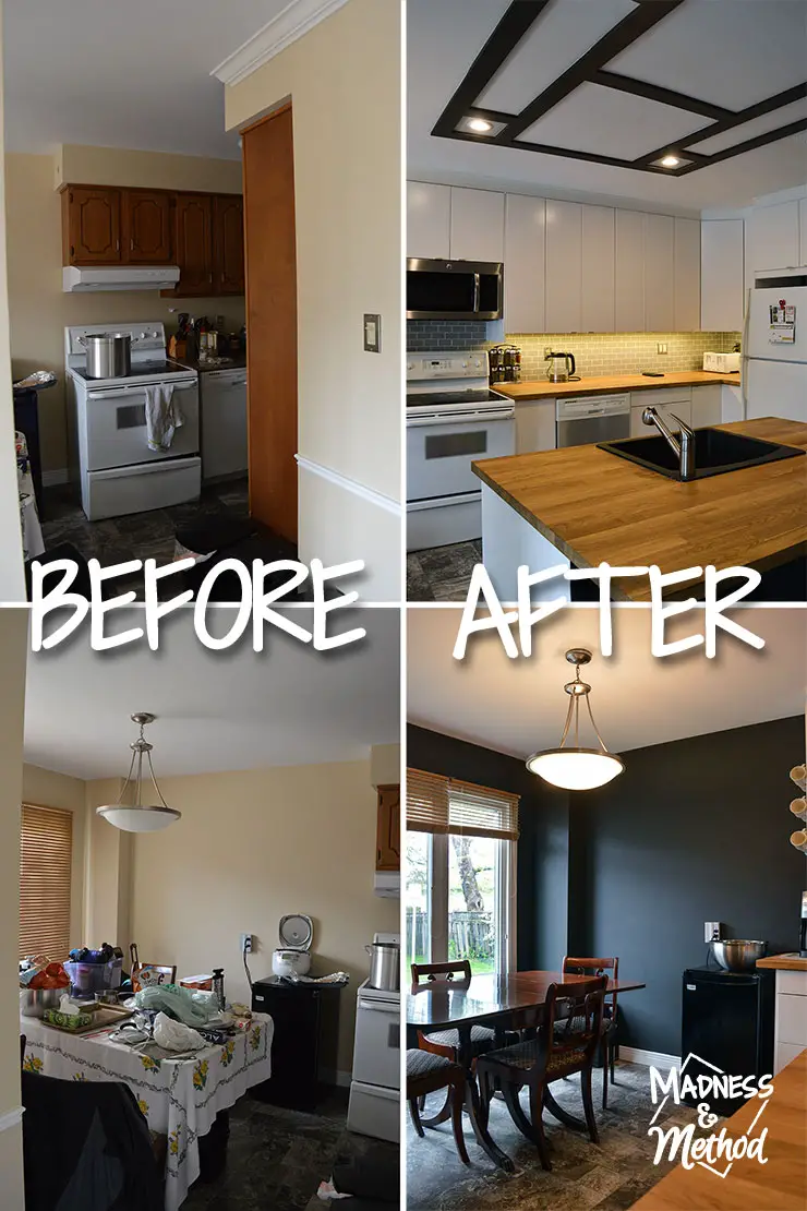
Do you remember what everything looked like before? They were definitely not able to fit all their stuff in the cabinets, and all the overflow went in the dining room. While it’s probably not as clean as I left it, at least the kitchen is a big improvement!
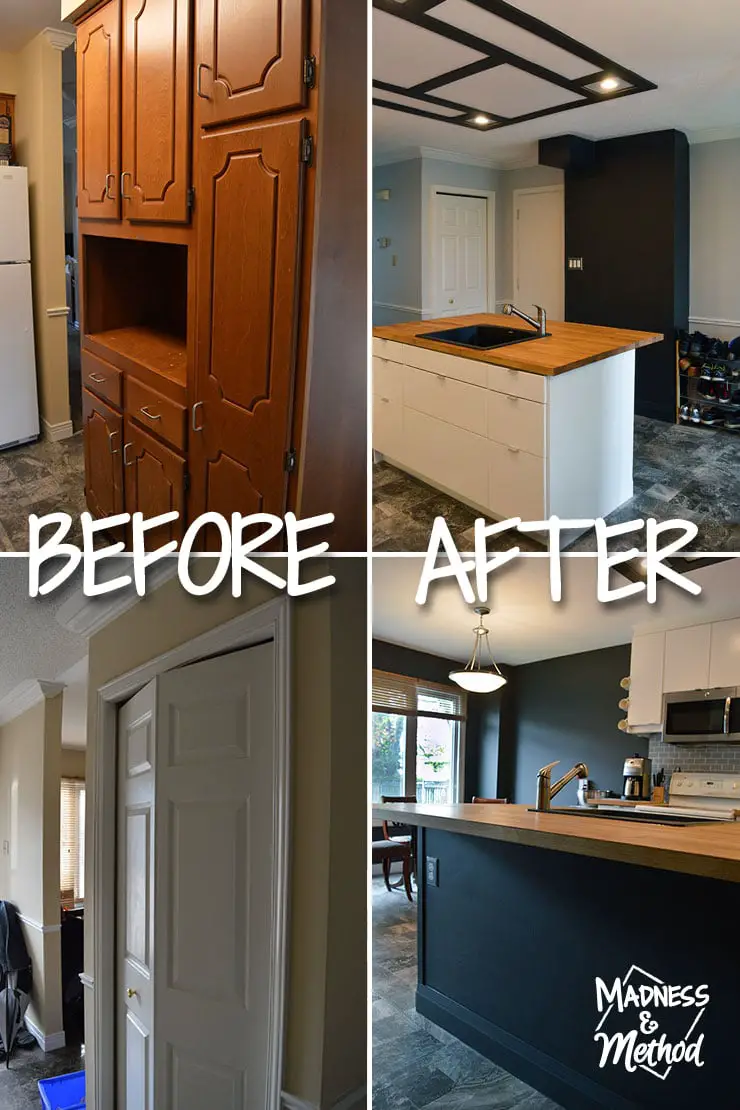
Taking out the centre wall allowed us to reconfigure the kitchen layout and add in twice the amount of cabinets. Technically, we were left with a bit less space on either side, but it doesn’t feel that way at all.
I just asked my brother how he felt about his updated kitchen (and bathroom), and he says he’s bummed the rest of the house isn’t as fresh and new… so I guess that means he likes it?
Ha, let me know what you think of his budget kitchen reveal, did it turn out the way you were thinking when I first shared the plans? There were definitely things we had to change as we went, so I’m hoping my next big renovation is a little more planned than this one…
Who knows when that will be though!?
(Seriously, I’m itching to break some drywall guys!).


3 Comments
Louise aka Mommy
August 29, 2017 at 8:44 pmLooks great! While not as clean as your pictures it is better than before. Weren’t you looking for a fall One Room Challenge? I’m sure Bro would mind another budget bathroom!
Kyla
November 24, 2017 at 11:59 amLooks so good! Love all the details! Esp the ceiling and butcher block countertops. And would never think to use black for walls but it looks so sleek! Cant believe you did this on a budget!
Nicole
November 25, 2017 at 9:17 amBlack on walls is such a fun, modern look – and it accents the ceiling nicely, thanks ;)